A convincing rectangle can make the wrong promise
Imagine you draw a booking page for a community print studio. At the top are three afternoon slots for the studio’s press. You circle the 2 p.m. slot, draw a rectangle marked Reserve, and add a checkmark to show what happens next. It takes a minute and communicates the layout well. What it leaves out is the difference between a user choosing a time, asking to book it and actually securing it. A prototype could make all three look like the same action.
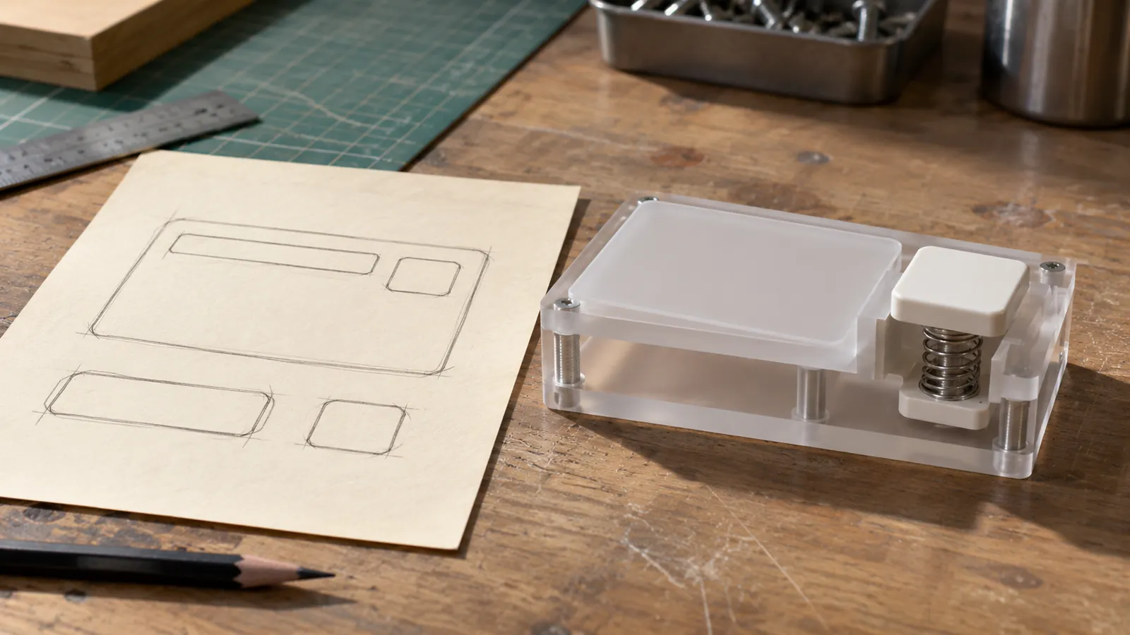
On November 5, Google described using a photo of a drawing to generate an interactive app in Gemini Canvas. Its walkthrough moves from uploading the sketch to generating code and opening a preview for revisions. It’s a practical way to make a drawing respond to input. Google’s example does not establish what a generated app will infer correctly about your own service. The print studio is a hypothetical example, not a reported test of Gemini.
A useful companion to the image is a short description of the promises each control makes. A layout says where the Reserve button goes. A behavior note says when it is available, what it requests, and what the visitor should understand after pressing it. That extra note matters because the finished screen can look polished even when it communicates the wrong outcome. People can work around a crooked rectangle; they cannot see the booking rule you forgot to write down.
Source: Google: Turn sketches into apps with Gemini ↗ · W3C WAI: Button Pattern ↗ · W3C WAI: Understanding Status Messages ↗
Sort the marks on the page before uploading it
Make a copy of your sketch and label the marks that have meaning beyond their appearance. A circle around 2 p.m. could mean the designer was pointing at an example, the visitor has selected the slot, or the studio recommends it. Those are three different inputs to a generator. In the print studio example, decide that the circle illustrates a selected state and that the app opens with no slot selected. Write those two statements together, so the visual emphasis does not quietly become the initial value.
Next, identify what the drawing leaves open. The studio may not care whether the time choices appear as a row or a short list at narrow widths. It does care whether those choices represent times for the same press or different presses. One decision can be delegated to the generator. The other belongs in the brief. Try using three labels in the margin: preserve, flexible and decide later. Put the real constraints in the first group. Put decorative choices or alternative layouts in the second. Keep open operational decisions visible in the third.
That last group is useful even for a solo builder. Suppose you have not decided whether the studio will let people cancel online. The generator has enough material to draw a Cancel button, but its presence would imply a policy. Leave it out of this version and say why. A brief that names a deliberate omission makes the prototype easier to discuss: a reviewer can ask when cancellation should be added without first having to discover that the screen is already making a promise about it.
Write the transition that the arrow stands for
Start with one action and use a single sentence: “When a visitor selects a slot, show that selection; do not create a reservation.” The first part explains the change on the page. The second defines the boundary between a temporary choice and a commitment. Now write a sentence for Reserve. “When a visitor activates Reserve, begin a request for the selected time and keep the selection visible while it is pending.” Add that another activation while the request is pending should not start a second request.
The interesting part comes after the request. Give the prototype three explicit outcomes. If the simulated request succeeds, show the selected time in a confirmation. If someone else has just taken the slot, explain why the request failed, refresh the displayed choices and allow a different selection. If a request stalls and the result is unknown, do not display a successful booking or present a second identical request as the obvious next move. A real service would need a reliable way to check the result. A local prototype can simply model the uncertain state and show what the visitor would be told.
Those outcomes can share one screen. The useful contrast is in what changes on it. In the pending case, the existing selection is still the subject of the request. In the conflict case, that choice is no longer offered as available. In the confirmed case, the confirmation answers what was booked and when. Ask the generator to keep the chosen time in each relevant message. “2 p.m. is no longer available” is easier to act on than an error badge that forces a visitor to remember which slot they chose.
Write down what survives a reload, too. In this example, pretend reservations exist only until the demo is reset and there are no real shared slots. If reloading clears the simulation, put that in the demo’s visible explanation. A reset should not teach someone that a real reservation can be canceled by closing a browser tab.
Specify how a person reaches and understands the action
A drawn button shows that someone should be able to do something. It does not say how the control is reached from a keyboard or how its purpose is conveyed by assistive technology. For the brief, say that Reserve is an actual button, with a visible name that describes its action. W3C’s WAI button pattern describes expected keyboard activation with Enter and Space, the need for an accessible name, and how an unavailable action is exposed. Using a native button is a sensible starting point for those semantics. If it is unavailable before a slot is chosen, provide a visible explanation near the slot choices rather than relying on the button’s dim appearance.
The time choices need an equivalent of the ink circle. Use a labeled single-choice group, with times that can be identified individually and the selected choice exposed to assistive technology. Make the selection evident in more than color. Decide what a keyboard user encounters first, where focus is visible, and whether a response moves it. For this example, an ordinary confirmation message can be presented in place. If you later add a separate confirmation dialog, that is a different interaction and needs its own focus behavior.
W3C’s WCAG guidance on status messages explains why an in-place update can need programmatic semantics: a person using assistive technology should be able to learn that the request is pending or complete without having focus pulled away merely to deliver the message. That gives the generator a more concrete instruction than “make it accessible.” Specify that an outcome appears as clear text and that its status is conveyed to assistive technology. If the 2 p.m. slot disappears after a conflict, tell the visitor why and where they can choose another time. If the update removes the focused control, give focus a meaningful destination rather than leaving the visitor to start at the top again.
These choices are easier to make while the example still fits on a sheet of paper. Sketch a second view for the person who cannot see the circle, the green checkmark or the change in opacity. Write the words and the order of the controls that would let that person reach the same outcome. You now have two views of one intended interaction.
Give the generator a brief it can disagree with
Attach the sketch and describe the purpose in one line: “Let a studio visitor practice choosing and requesting a press slot using fictional data.” Then include the few constraints you would be annoyed to discover had changed. “Start with no selection. Selecting a slot never books it. Reserve starts a simulated request. Provide ways to demonstrate pending, confirmed, unavailable and unknown results. No real accounts, external booking calls or notifications.” Add the accessible behavior you just specified. If a policy is unresolved, say to surface it as a question rather than assume an answer.
There is room for design latitude after those instructions. Ask for a readable mobile layout and let the generator decide whether the choices wrap or stack. Ask it to keep the two-step interaction recognizable, even if the generated version uses more space or cleaner typography than the drawing. You preserve the meaning of the sketch without requiring the output to treat a line made by a pen as an exact measurement.
If you revise the prototype through chat, name the intended effect of each request. “Show the pending state more clearly” leaves open whether the generator should invent a new step. “Keep the same request behavior; add visible text naming the selected time while the request is pending” gives it a smaller target. Conversely, if you want to change the policy, say so explicitly: “Let people change the selection before pressing Reserve, but freeze the selected time after the request begins.” Save that sentence alongside the sketch. The resulting UI is easier to explain when the source of a change is visible.
Walk a visitor through the uncertainty
Once you have a preview, try a walkthrough centered on what the visitor would believe. Begin with no selection. Choose 2 p.m. and stop before pressing Reserve. Ask what has happened and what has not happened. Then activate the action and pause during the simulated wait. Is it clear whether the request is still pending? Move to a conflict, then to success. At each step, compare the status reported by the screen with the promise in the behavior note.
Do one pass without relying on a mouse or color. Can you reach the slots and the booking action in a sensible order? Can you identify the selection and the result without seeing the original sketch? If you have access to a screen reader, check what is announced when the simulated state changes. These checks can expose mismatches worth fixing. They do not establish that a future booking service is reliable, or replace a fuller accessibility review of whatever you eventually release.
If a reviewer says “I thought I had booked it as soon as I touched the time,” write down what made them think that. The trouble might be a label or the position of a message. It might also be an unresolved design choice: perhaps the studio wants a one-tap hold, but the brief says the first tap only selects. A revision to the text alone cannot resolve a disagreement about when a commitment begins. Settle that question and update the behavior note before asking for another visual pass.
The first prototype is most useful when it helps you have that conversation early. It turns the marks on the page into something a person can operate, and the behavior note gives you a way to tell whether the operation still means what you intended. A good final question for a sketch is therefore simple: if someone used this without ever seeing my drawing, what would they think they had just done?
Try this, then make it yours.
Circle a control in a sketch and write what happens before activation, while it runs, and if it fails. Include what the user hears or reads at each step.
Follow the signal.
Our reporting starts here. Practical suggestions are our analysis, and vendor performance statements are claims unless independently verified. We haven’t hands-on tested this release.
- Google: Turn sketches into apps with Gemini ↗ · 2026-11-05
- W3C WAI: Button Pattern ↗
- W3C WAI: Understanding Status Messages ↗